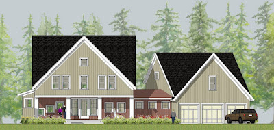
I have included a number of the studies below. The client has selected a medium gray for the base body color; however I also did a couple of non-gray variations. The black roof is a given on all schemes. Which one would you choose?
 |
| scheme 1 - all white horizontal clapboard siding |
 |
| scheme 2 - gray board and batten siding, rusty corrugated metal inside porch and in 'link" area |
 |
| scheme 3 - dark gray board and batten body color with white clapboard inside the porch and in link area |
 |
| scheme 4 - gray board and batten body color with dark plum inside the porch and in the link area |
 |
| scheme 5 - gray board and batten body color with white clapboard inside the porch and in the link area |
 |
| scheme 6 - gray board and batten body color with dark gray shakes inside the porch and in the link area |
 |
| scheme 7 - gray board and batten body color with white shakes inside the porch and in the link area |


Hi,
ReplyDeleteI just couldn’t leave your website before telling you that we truly enjoyed the unique and quality information you offer to your customers...... Will be back often to check up on new an additional posts.
Have a wonderful day!
Definitely scheme 7
ReplyDeleteI think you'd find the perception of the house significantly changes as you think of various trim colors as well- I noticed in all renderings you left the trim white, which makes for a very dramatic look in scheme 3, which is probably my favorite.
ReplyDeleteAre you using Illustrator for the renderings, or something else? Just curious.
Christopher - Thanks for the comment.
ReplyDeleteI am using sketchup for the renderings and color studies. I have an entourage library that helps bring some life to the sketches.
Just found your site, and love it. I'd go with scheme 1, or maybe scheme 3... apparently I'm a purist... or I just like old things and hate change! Scheme 1 is so pretty, like an old farmhouse but more elegant.
ReplyDelete